Binning and Heatmap Visualizations on Maps
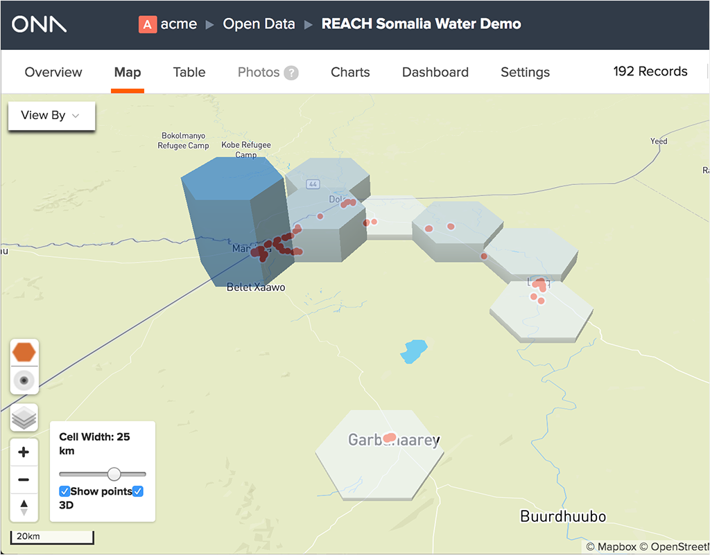
To help you visualize large datasets on a map, we added binning (including 3d!) and heatmap visualizations. Displaying points works well for small datasets, but a large number of submissions can cause overlapping points, which misrepresent the data and make it difficult to see geospatial trends. Hexbins and heatmaps solve that problem through binning — combining points into groups — and showing density with the resulting geospatial shapes.
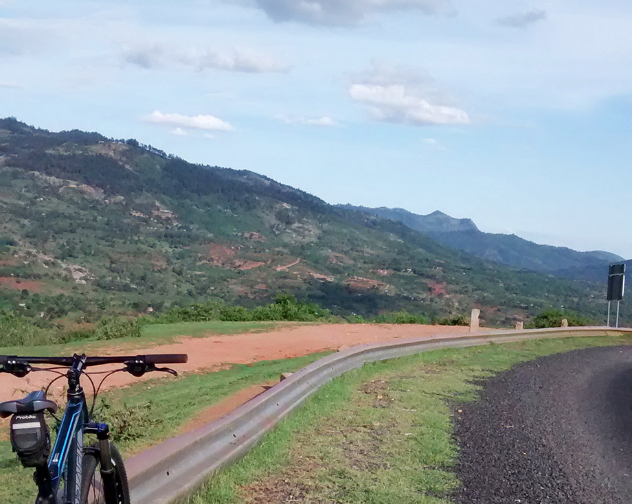
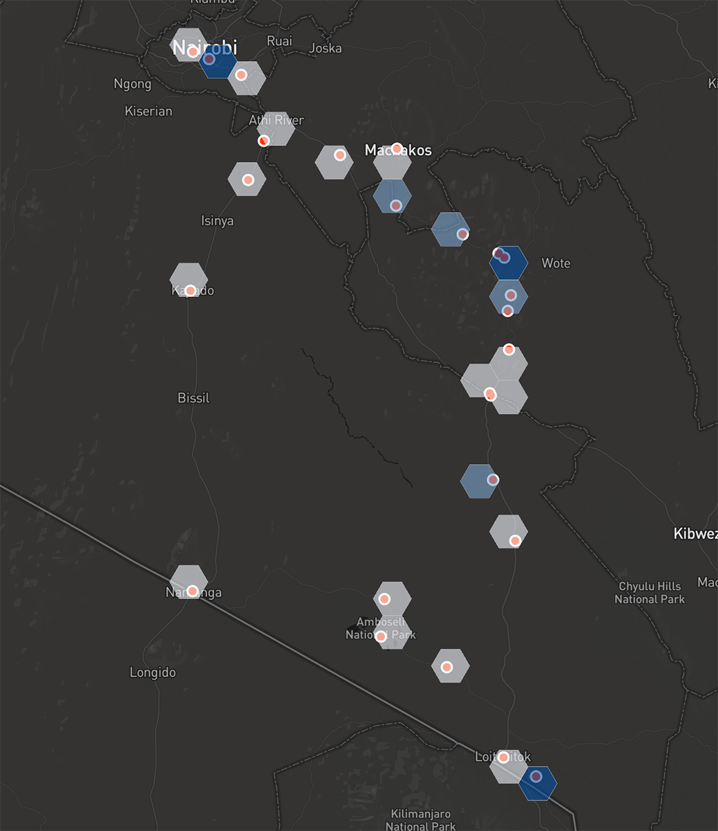
We can take a look at how this works by examining a dataset from Roy, an Ona engineer and avid cyclist. Roy’s Oloitoktok bike trip dataset captures his multi-day, roundtrip ride from Nairobi to Oloitokitok in 33 submissions.
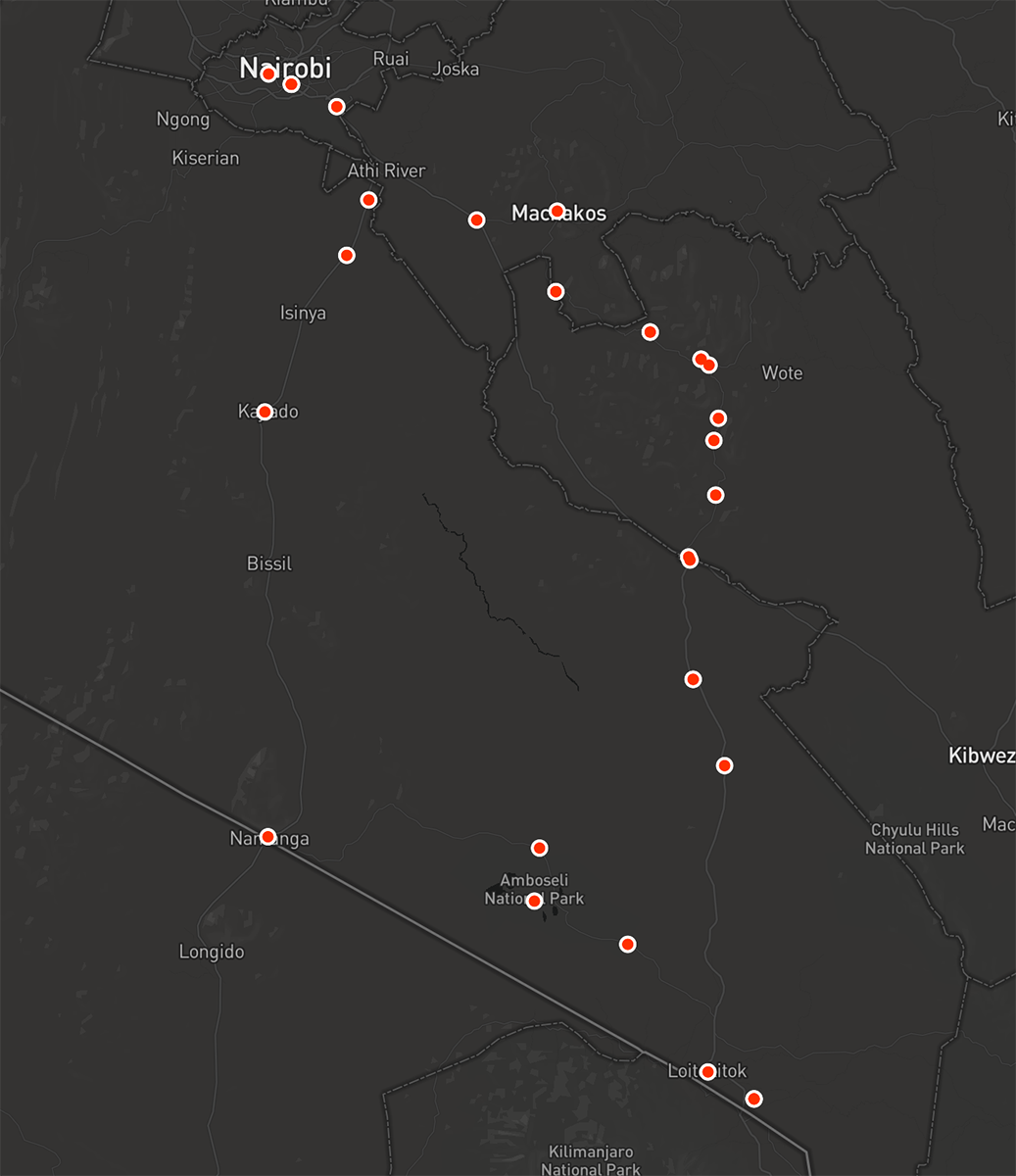
First, we can look at the map with points and unfiltered submissions. (For your own datasets, you may choose to filter by specific fields — hexbins and heatmaps will work.) Roy’s submissions show his route, going down an eastern road through Machakos, then coming back through Kajiado.
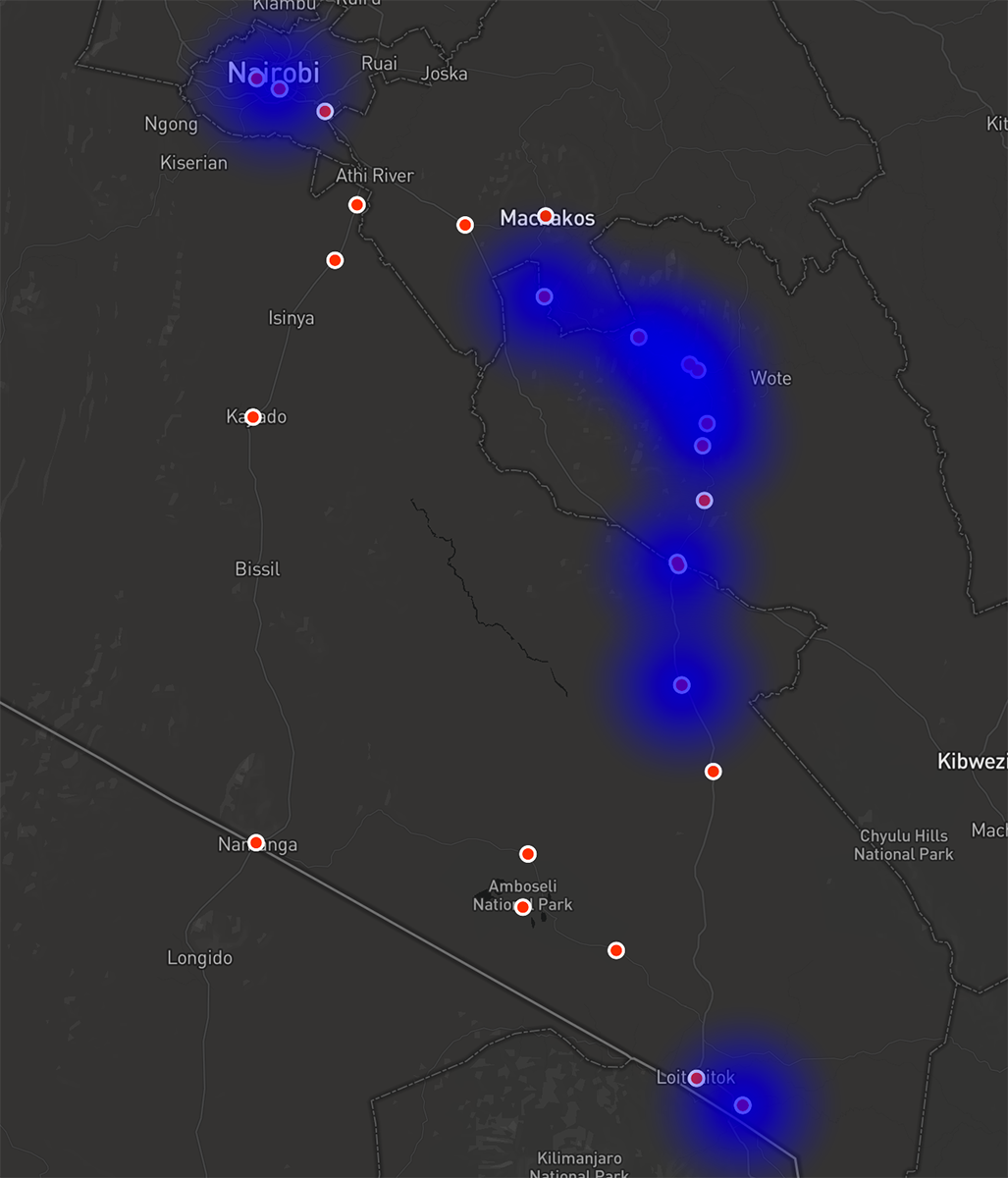
If we turn on the heatmap, it becomes clear that he sent in fewer subsmissions on his way back. Specifically, the heatmap shows the first half of his ride down was his most active period, with a few destination submissions in Oloitoktok. His way back is definitively not hot. Whether this was because he was tired, the scenary was less scenic, or he was in a vehicle… you’ll have to ask him.
If we look at the binning visualization, it’s clearer where he had extra time or enthusiasm: at the start, near Wote, and at the destination. Closer examination of the Wote submissions reveal that’s where Roy had a good night’s sleep.
Try binning and heatmaps on your datasets and be sure to tweet @onadata if they’re useful for your data explorations.