Introducing Akuko!
We’re excited to announce the launch of a new product called Akuko. Akuko is a data storytelling platform that makes it easy to build interactive maps, charts and tables, from different data sources and combine them with photos and narrative text to tell a story with data.
In building hundreds of dashboards for clients over the years, we have found that dashboards are great at telling you what is happening, but not necessarily why. A key use of dashboards we have found is a source for screenshots that are included in reports or presentations where additional context is needed for shared insights. While we still love dashboards dashboards (Akuko is actually great at building dashboards too!), we see an important role for data storytelling for anyone wanting to use data to better communicate key insights to specific audiences.

What does Akuko do?
We’ve been successfully using Akuko with client projects for the past few months and feel it’s ready to share to a broader audience. The best way to learn about Akuko is to check out some sample posts below and check out the Akuko docs website.
Sample posts:
- 2021 World’s Happiness Report
- Which states love their craft beer?
- World Cities
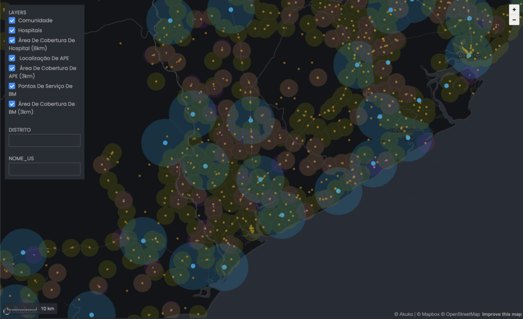
- Microplanning for Covax
Key product highlights:
- Ability to create data sources from static data (CSV, GeoJSON) or mapped to real time data sources like PostegreSQL and Google Sheets, etc.
- Ability to define metrics on top of your data sources and run lightning fast BI operations to query and visualize your data.
- No restrictions on data publishing – A lot of BI tools are great and affordable until you want to publish your work. With Akuko you can share your insights to the world or keep your work private within your organization.
- A no-code interface making it easy for a non-technical person to develop rich interactive maps, charts and tables.
- World class maps – We make it easy to build beautiful interactive maps (powered by Mapbox) with easy to use data styling that loads fast (dynamic vector tiling). We’ve built a LOT of interactive maps over the years and we built the missing map builder we always wanted.
- High quality, consistent data visualization components – While this is still a work in progress our goal is provide a set of high quality data visualization components that are visually and semantically consistent with each other. When it comes to data visualization we are opinionated and sometimes we will purposely limit options to help our users make better visualization decisions.
- Travel blog worthy image support – Photos uploaded are automatically resized and optimized for the web and served up through a CDN to ensure the photos that illustrate your stories look great and load quickly.
- Medium inspired writing – we keep it simple and it looks great.
What does Akuko mean?
Akuko means “story” in Igbo, a popular language spoken in South Eastern Nigeria. We came across the name while working in Nigeria on a project to use data story approaches to better understand barriers to health access and felt it was fitting. Our goal with Akuko is to empower organizations to make better use of data to tell the stories important to advancing their work.
How can you learn more?
We will be sharing a lot more information about Akuko over the coming weeks, but it is available in a limited beta. If you are interested in learning about Akuko, please contact us for a demo. We’re excited by what Akuko has allowed us to do. We are excited to now be able to start to share it with you.

