How We Launched a COVID-19 Public Messaging Effectiveness Dashboard with UNICEF in Two Weeks
The COVID-19 pandemic poses new and unique challenges to governments and development organizations engaged in public health across the world. On a project supported by the Government of Japan, UNICEF Cambodia is assisting the government and other partners’ responses to the pandemic through Risk Communication and Community Engagement (RCCE) messaging, helping to educate the public and raise awareness on vital behavior changes required at this time. In order to understand how RCCE messaging influences citizen’s behaviors, UNICEF developed a detailed questionnaire and partnered with Ona to collect and visualize the data, resulting in the publicly-accessible COVID-19 Awareness Survey dashboard.
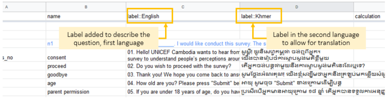
The UNICEF team independently designed the survey and administered it to its target beneficiaries, with Ona Data serving as the data collection platform. Data collectors accessed the questionnaire in either English or Khmer depending on their preference, a feature made possible using multiple language forms where translations are created in XLSForms via label columns. In this case, ‘label::English’ and ‘label::Khmer’ columns were created:
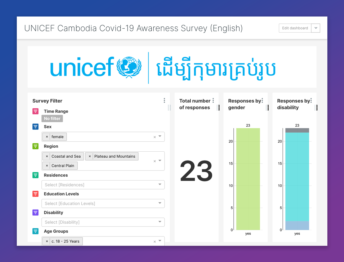
With data collection under way, the UNICEF team required support analyzing the results and contacted our data solutions team to create a dashboard using Ona’s Canopy Discovery platform. In particular, they wanted their analysts and the public to understand whether there were gender-, area-, or disability-based differences in the adoption of COVID-19 related safety practices or understanding messaging.
Since Canopy has common dashboard features built in and integrates directly with Ona Data, our team of data analysts were able to prepare and restructure the data and have a draft of the dashboard in just one week. After a few rounds of feedback, the UNICEF team was able to utilize the tool and follow the data collection process in real time.
Data analysis challenges
We worked with the UNICEF team to build dynamic filtering, where results could be disaggregated by several factors, while at the same time displaying the percentage of respondents across categories:
With survey data collected using Ona Data or other ODK data collection tools, every form submission is stored as a single row in a table and every survey question represents a column in that table. While this makes sense when looking at individual submissions, it makes comparing within groups particularly challenging as the information may be stored across many columns and rows at the same time. Consequently, the core of our work was restructuring the dataset to facilitate analysis, which we achieved by applying the tidy-data framework.
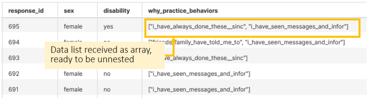
The main constraint for this specific dataset was understanding how to extract information from questions that allow multiple selection using arrays, which PostgreSQL manages natively. Data stored as an array means that the entire list of preferences can be stored in a single cell. For example below, respondent 695 indicates two preferences:
Unnesting the code required creating two separate rows for this content so each option is saved separately, using SQL code like this:
Select
unnest(r.challenges_implementing_actions) as option_initial,
'challenges_implementing_actions' as arrayname,
unnest(r.challenges_implementing_actions) as option
FROM kap.covid_survey_responses r
After extracting the information from the arrays, the resulting dataset includes multiple rows for each participant, one per each question and option selected, where the added length allows for easier filtering. Within a few clicks, we could create a dedicated report and understand, for example, the number of male participants versus participants under age 15 thought the elderly were at high risk from COVID-19.
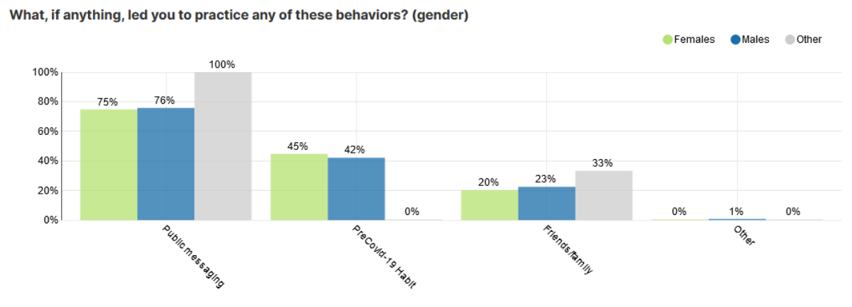
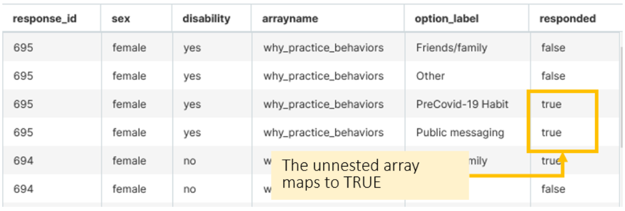
The second data preparation challenge was to create visuals showing proportions of respondents who responded yes for specific questions/options, e.g. what share of respondents had increased hand-washing as a result of the public messaging. Since arrays only store data on the options selected, we could not immediately account for the options that were available but not chosen by a respondent, e.g. account for a participant that increased hand washing because of suggestions from friends and family, but not because of direct exposure to the public messaging.
Our solution involved generating a separate boolean column called responded, which returns true for all the options selected, and false for the available options that were not selected. The final table then had even more rows, where each responded had a one row for each of the possibilities allowed in the list. In the example below, we see how respondent 695 had indicated two preferences out of the four options.
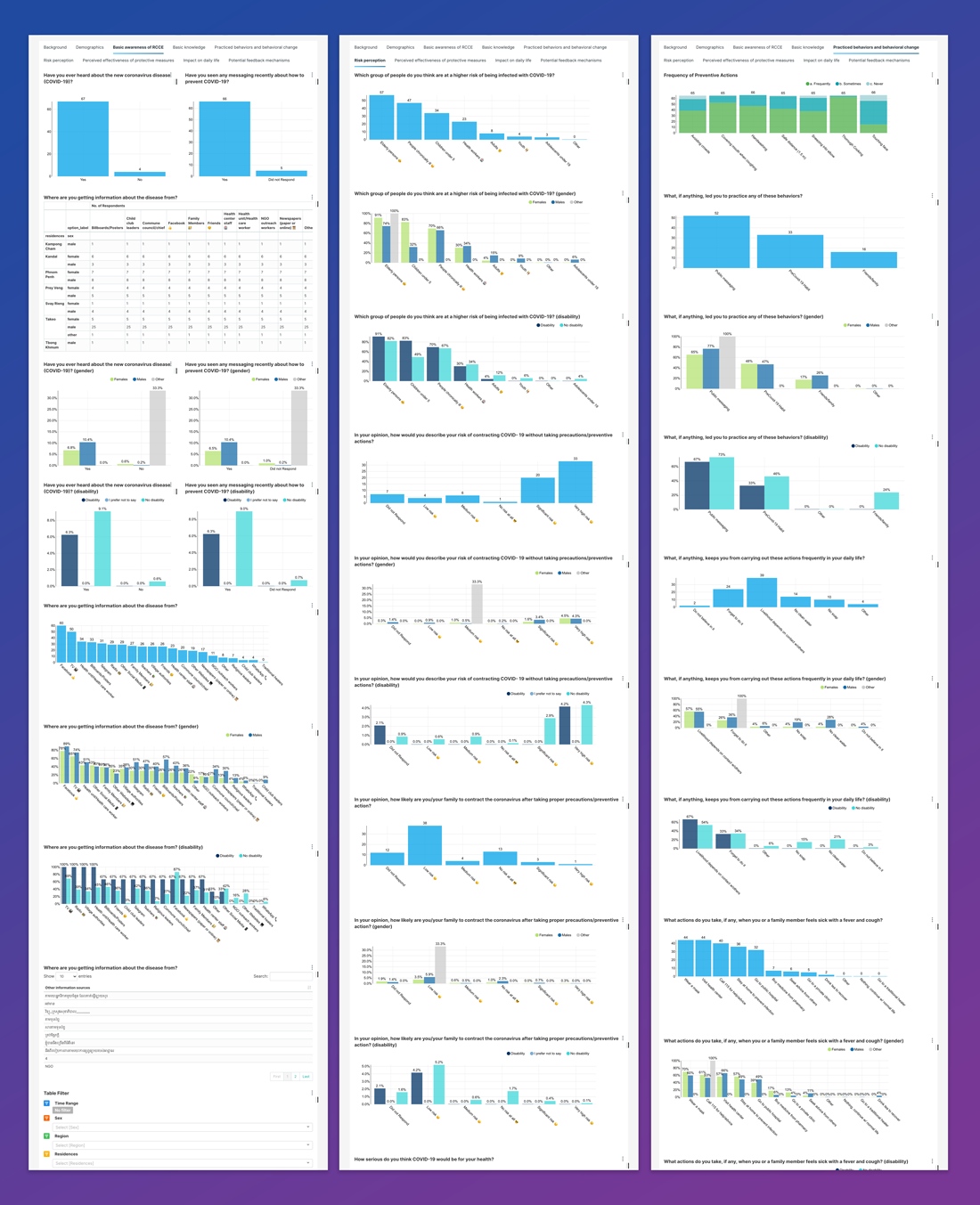
The final output is a simple yet powerful interactive dashboard that allows anyone to explore data and understand how different segments perceived COVID-19 messaging campaigns. In particular, users can quickly identify subsets of respondents left behind from government campaigns. UNICEF Cambodia can use this information to support equity and aid campaign managers in structuring their programmes. The dashboard provides an understanding of how the situation impacts groups sensitive to outbreaks such as children, the disabled, and remote and rural areas differently from the larger population. We are grateful to UNICEF for the opportunity to work together on such a relevant topic and show how good preparation can allow data to shine.